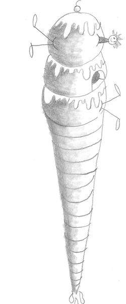
Ice cream dilemma
Here is a fun drawing I did not too long ago. I am working on my drawing skills because I realized that the illustration course was a little hard for me. I am going to come back to that, and I am going to keep posting on here whatever I am doing, or working on. I have signed up for all the picture book illustration classes on Craftsy.com, and if I can keep going, I want to work through those classes, and write and illustrate a picture book, and hopefully publish it myself, and sell it on amazon. I am a while away from that though, so I am going to start here with this drawing.
baby illustration sketches January 25, 2016
I did this quick little sketch last night. The next part of the lesson deals with drawing different age groups. This is a baby, and I want to do a more finished piece of this on drawing paper, or watercolor paper. I was trying to get the legs more correct, and thinking about what positions I can draw her in, and what kind of clothes she might wear.
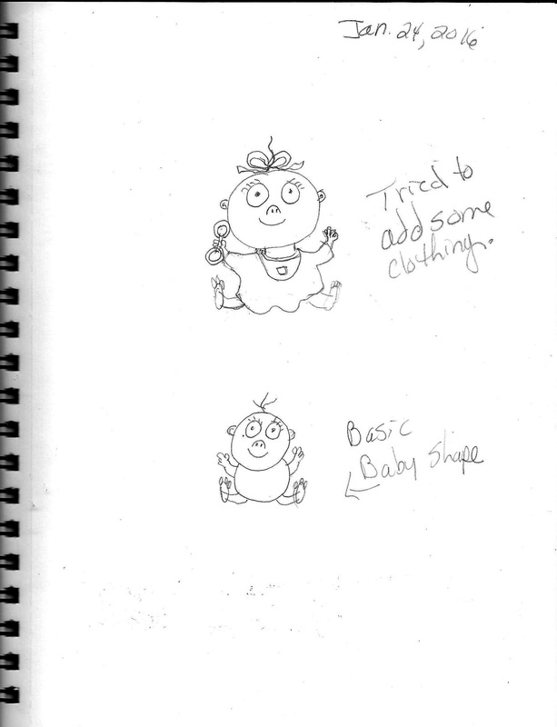
A new picture book class January 24, 2016
I am taking a new online picture book class called, Drawing Expressive Picture Book Characters, and it is being taught by Lynn Chapman. I started this class earlier this month, and I am really taking my time to work through it.
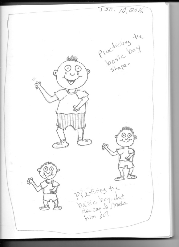
This is the first page of my sketchbook for lesson one. I drew this little boy using the basic snowman shapes that Lynn talked about. After that, you build the character up around the shapes. I did that three times on this sketchbook page, and the first one at the top of the page came out better than the second and third ones at the bottom of the page.
I realize that I probably should be posting these pictures on the sketchbook page of my website, but I want share the process of what I am learning. Therefore, I am posting it here. :0)
The best thing about this is that I am learning to draw human characters which I haven't done before. They are very cartoon like, but I like drawing that way. Some illustrators prefer a more representational way of drawing, but I really like the cartoon style.
Eddy bear's pencil rocket September 13, 2015
|
I decided that Eddy Bear needs a rocket that looks like a rocket. Okay, it's a pencil rocket, but still, a rocket. Maybe he will take his drawing skills to outer space where he will teach aliens how to draw, and express themselves through art. That's funny! Maybe I should start doing these in color. :)
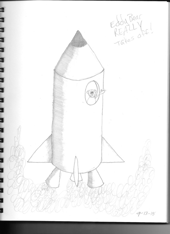
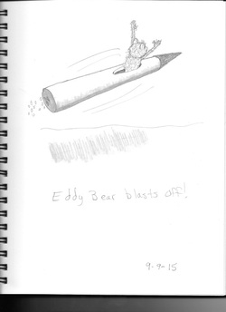
I did a quick sketch of Eddy Bear blasting off in his pencil rocket. It's a fantasy world, it doesn't have to be a regular rocket. Maybe he is going into a drawn space adventure. Maybe that would be a little hard for kids to grasp. Maybe he built this giant pencil rocket. It came from the Acme Pencil Rocket Company. You know, a build your own pencil rocket thing.
Just one thing to think of-why is he going into space? Maybe he wants to be a space bear. Or the first bear in space. Maybe he plans on just flying the rocket like a plane, but he overshoots it, and ends up going into space. Then he finds himself landing on another planet where there are other beings that look a lot like him. He finds bears, but they are all martian bears! Wait, instead of landing on the planet, he crashes on to the planet. So, now he has to find a way to repair his rocket, and get off the planet to get home, but he needs help. Are the martian bears friendly?
I have to do more drawings and think a little more about what I am going to have this little guy do. Right now, I just have him leaving planet Earth, but he should have some kind of life here on this planet before he takes off. Then I can start thinking about the problems he will have on the Martian Bear planet. He has to have a few problems for the story to look right. Yep, more to draw, and more to think about.
first sketches of eddy bear Tuesday, Sept. 8, 2015
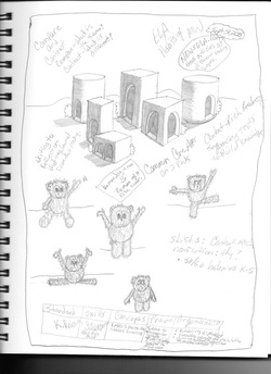
Here are some first sketches of Eddy Bear! Eddy Bear is just now showing up in my sketchbook after I have spent time thinking about what I want my next book on storyjumper.com to be about. I started thinking about his little bear, and what kind of adventures I might be able to send him on. Right now, I'm leaning towards a space adventure.
I named him Eddy after my father whose name is Edward. His twin sister use to call him Eddy. One thing that dad an I like to do is watch this television show called Ancient Aliens. It's all based on speculation, but we have fun watching this show. I personally don't believe in aliens, but I think people who say they have had an experience of some kind really believe that they had an experience. I believe they think they are telling the truth. Anyway, we get a kick out of how they come up with all these ideas of how ancient aliens might have created us, and how they may have helped us to get to where we are today, or how they helped build things like the Pyramids of Egypt, or Stonehenge. (For some reason, these people can't give credit to humans for creating these things.)
I don't know what kind of space adventure I will send him on yet, but I am going to have to sketch him a lot and try to see if I can get to know this little guy a little better. Who is he? What does he want to accomplish in his adventure? Can I make him interesting for children to want to read about him?
By the way, I did these sketches during an in-service at work this morning, that is what all the notes are around the pictures. The in-service was about Common Core Language Arts- reading and writing basically. Try to ignore the notes if they are annoying. More to come!
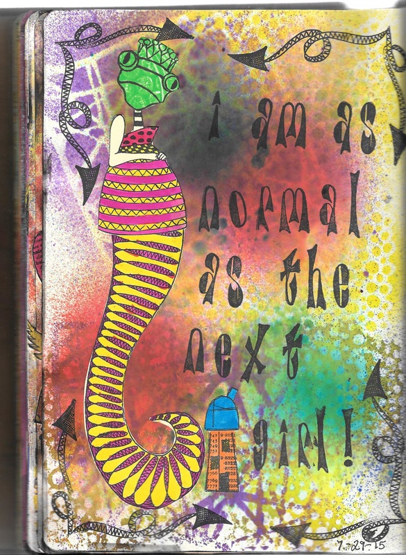
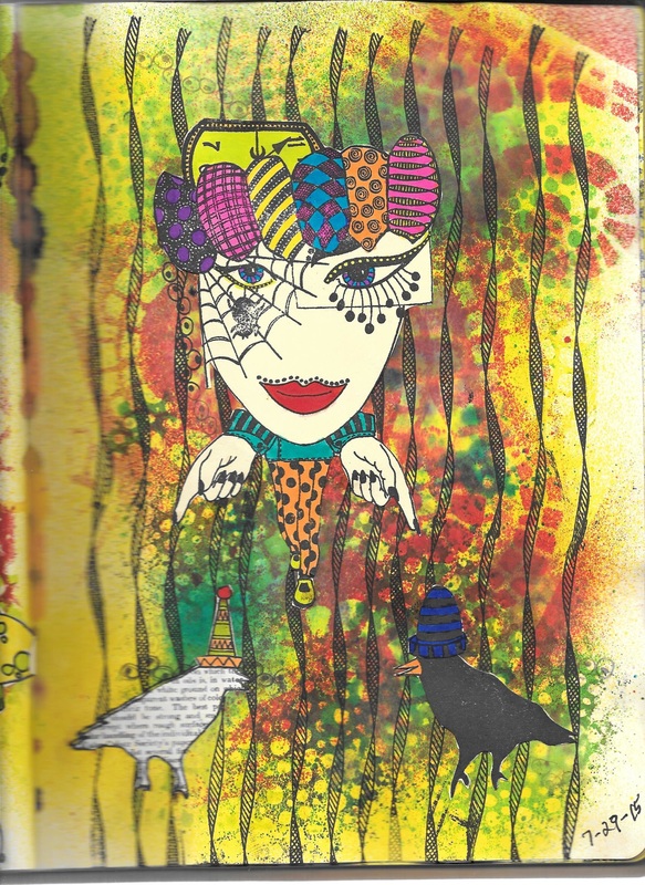
Art Journal days Sunday August 2, 2015
I had a few days this past week where I had some time to do some art journaling. The bottom three entries were done on pages that I had already done the backgrounds for months ago. So those are the usual ink backgrounds. I recently bought some new Dyan Reaveley stamps, and some of her new paints, and I have to say that when I first saw her use them on YouTube I wasn't sure I wanted to try them. A few months have gone by now, and I decided that I wanted to give them a try.
In one of her videos, Dyan said that you can spray ink on top of the paint, and still get a background that looks nice. That's true, it does look good. The top picture just under the text here is done with Dyan Reaveley's new Lemon Zest paint. It dried very quickly, and when I sprayed her inks on the paint using my stencils, they looked really great! I don't necessarily have to spray water on the page to get a good background with the inks. I can start with the paint then add the stencils and ink. It took the border stamp really well, but you had to wait a little while for it to dry or else you could smudge it. One of the things I really like about using the paints is that the paint doesn't soak through the page to the other side. And when I sprayed through the stencils with the ink, that also didn't go through the page.
I am glad I tried them now. These paints are really good paints, and I wonder if I can use them on canvas that has been gessoed. The inks pastel out when you spray them on a canvas with gesso, but the paints probably won't do that, and after it dries, I bet you can spray the ink on the substrate and it won't pastel out. I need to try that.
More Sketchbook Pages Monday, March 30, 2015
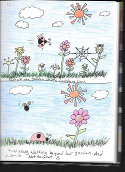
I was able to get a few pages scanned and uploaded to my computer. The two bottom pages I did last week, and I wanted to include them here.
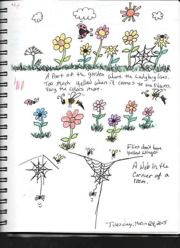
The first page is a split page. I actually took two drawings from my sketchbook that I doodled out, and enlarged them a little. Both of these are about Ladybug, a little character I am thinking about writing about. Top picture is where she is in her garden, and a spider lives there as well. In the bottom picture, she ventures out of her comfort zone to a different place that doesn't
The first page is a split page. I actually took two drawings from my sketchbook that I doodled out, and enlarged them a little. Both of these are about Ladybug, a little character I am thinking about writing about. Top picture is where she is in her garden, and a spider lives there as well. In the bottom picture, she ventures out of her comfort zone to a different place that doesn't
doodling Sunday, March 29, 2015
I spent some time doodling today. This page was actually done a few days ago, but I wanted to include it in the web page. Actually, I have done several pages like this in my sketchbook, but I don't like the way the keep scanning into the computer, so it might be a while before I get the other pages posted here.
I just thought of something; this is a page in my sketchbook, so it should probably be in the My Sketchbook section of this web page. Oh, well, it's okay.
I will keep trying to get my pages scanned in here, and have them look right.
I just thought of something; this is a page in my sketchbook, so it should probably be in the My Sketchbook section of this web page. Oh, well, it's okay.
I will keep trying to get my pages scanned in here, and have them look right.
First Journal Page about spring Wed. March 18,2015
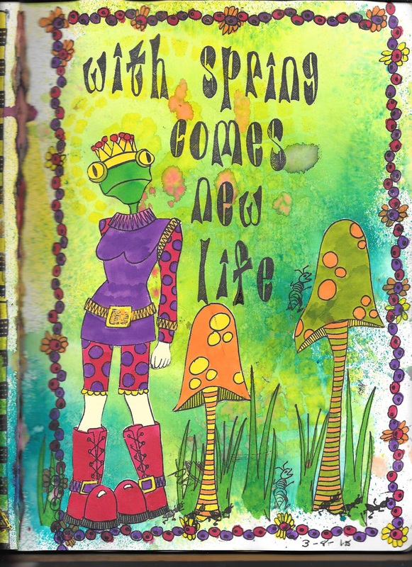
This was the first page I did on spring. This is a new set of Dyan Reavely stamps that I have been wanting to use. Everything is new except the border, and the frog head. The frog head cam from antoher set of stamps. As I got to doing this one, I started to think about what I wanted to say on this page. Since the body stamp was headless to begin with, I thought it would be funny to create a new creature, so I gave her a frog head. With spring comes new life. Of all kinds. :0)
Art Journal page about spring Wed. March, 18, 2015
This is a typical art journal page done with my Dyan Reavley stamps, and inks. I have been on spring break this week and we had a little warm weather, so I wanted to do a couple of art journal pages on spring.
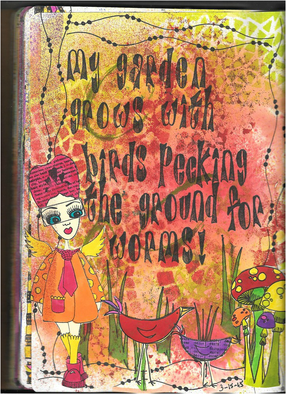
Spring usually means it is time to get the garden going. I see a lot of gardens this time of the year, and that includes the flowers I find at the park. They are all starting to come up. But there is one other things that comes with spring. Birds looking for worms after a nice spring rain. I did this one a few days ago, and I have been meaning to post it for awhile now. This one was fun to do.
Spring usually means it is time to get the garden going. I see a lot of gardens this time of the year, and that includes the flowers I find at the park. They are all starting to come up. But there is one other things that comes with spring. Birds looking for worms after a nice spring rain. I did this one a few days ago, and I have been meaning to post it for awhile now. This one was fun to do.
leaf in the eric carle style Wednesday, Mar. 18, 2015
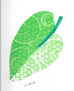
I have been reading about the author/illustrator Eric Carle. He has written and illustrated many children's books like The Very Hungry Caterpiller. The book I am reading is called The Art of Eric Carle. I love reading about his life, and how he does his art. I have also been watching a number of videos about him on YouTube, and mentions that he hopes his artwork will inspire others to make art.
After making a bunch of prints with my Gelli plate printer, I thought it might be fun to try to do a piece of art like Eric Carle. I took an activity book for children that had large and simple drawings that Eric Carle had done, and I traced it onto watercolor paper. I found few of my first prints that I did a couple of weeks ago, and traced the leave onto the back of the three prints. The darker side of the leaf is the positive image on the print, while the lighter side is the negative of the same print. The stem was a totally different print.
I did each piece by section, cut them out, and glued them to the water color paper. The print was done with bubble wrap, and a yogurt container, and the lid of a paint bottle. Instead of painted tissue paper, I did prints on regular drawing paper, and put the picture together. It was fun, and it made an interesting looking leaf.
growth and change Thursday March 5, 2015
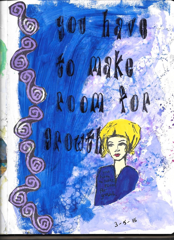
I did this page this evening. I got to thinking about growth and change, and what all it takes to achieve those things. Making room for change could mean getting rid of the clutter in life to make room for some kind of growth. I'm still thinking about it.
I used a few new stamps with this page. The girl is a new Dina Wakley stamp, and so is the swirly design stamp running down the left side of the page. Since I have been studying the color wheel, and color theory, I was trying to keep my colors as analogous as possible in this one. Often times my backgrounds are partly done by chance. I clean my stencils and stamps off in the my journal, and that just becomes the first layer of that page. When I was cleaning my stencils and stamps, I cleaned them on a page I had not gessoed yet, so I had to put gesso on the page over the stencil and stamp cleanings which made the page look purple and bluish. I went with that. I spread the blue acrylic paint on the page ccovering only a part of the page, not the whole thing. I stamped the girl on another piece of cardstock, colored her in, and collaged her onto the page.
I recently bought a Gelli Printing plate, and I made several prints with it. I chose a print I did in purple, stamped the curly image onto it, cut those apart, and collaged them onto the page. Since I am studying color and the color wheel, I was trying to keep this page as analogous as I could. I was trying to balance out the purple and the blue. I still need to work on using my colors.
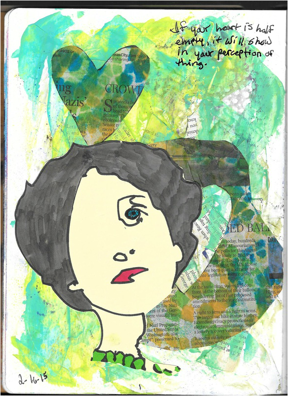
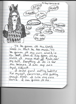
three day weekends rock! Sunday, Feb.16, 2015
Three day weekends are the best! I have had three days to work on my art journals. This page I did yesterday. I clustered the word "empty" and realized that we all have hearts that are either empty or full, or somewhere in between. Either way, it will affect your view on life and the world you live in.
The woman's head is a new stencil from Dina Wakley's line. Actually, this one has been out since last fall, but I didn't get my hands on it until this past Friday. I also got some of the new Dina Wakley stamps, but haven't done anything with those yet. I am waiting on the delivery of three new Diana Wakley DVDs I ordered last week from North Light Books. They are all on her different techniques that she uses when she art journals. NLB is going to have an online class with Dina Wednesday afternoon, which is my birthday, and I have other things planned. Besides, I like DVDs because I can watch them over and over again until I get it right.
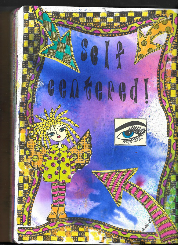
Back to this page, this is from art journal number 2. Some people might think this is a self-centered topic to journal about, but I think that is okay because we are all a little self-centered anyway.
The woman's head is a new stencil from Dina Wakley's line. Actually, this one has been out since last fall, but I didn't get my hands on it until this past Friday. I also got some of the new Dina Wakley stamps, but haven't done anything with those yet. I am waiting on the delivery of three new Diana Wakley DVDs I ordered last week from North Light Books. They are all on her different techniques that she uses when she art journals. NLB is going to have an online class with Dina Wednesday afternoon, which is my birthday, and I have other things planned. Besides, I like DVDs because I can watch them over and over again until I get it right.
Back to this page, this is from art journal number 2. Some people might think this is a self-centered topic to journal about, but I think that is okay because we are all a little self-centered anyway.
The idea of being self-centered sort of caught me on that journal entry, so I started to create a page I wasn't sure of where I was going with it. I was feeling inspired by the idea of new Dyan Reaveley stamps and stencils, that I went back to using her stuff in art journal number 1. The letters are new. I wanted to get the letters that she has had out for a long time that are made of red rubber stamps, but those are $30.00 a set, and I didn't want to spend that much. I found that Dyan has made a set of letters that are clear cling stamps instead of red rubber stamps, and they were $13.99 a set. I bought those because that fit my price range better.
In this entry, it is about self-centeredness, yet the girl is not in the center of the page. She is off-centered. The eye represents what other people see, or what they think they see in a person, and it is usually over exaggerated.
In this entry, it is about self-centeredness, yet the girl is not in the center of the page. She is off-centered. The eye represents what other people see, or what they think they see in a person, and it is usually over exaggerated.
Thoughts on journaling Sunday, Feb. 8 2015
After seeing the 2015 CHA Mega Show on Youtube, and noticing all the new stuff Dina Wakely and Diane Reavely has coming out in the spring, I decided I wanted to get back to art journaling. not just art journaling, but regular journaling. I read Dina's new book Art Journaling Courage, and I thought a lot about the writing that I want to include in my art journal.
For the most part, I have been adding quick thoughts, but nothing really from me. After all, any journal should include as much of the self as possible. Not just a record of the day. or of something that happened that was unusal.
I didn't really want to do the writing part the way Dina suggests in her book, because I'm not big on lists. I lean more towards clustering. A writing technique I learned in college.
And that is where this journal page came into play. The image is a new stamp from Diane Reavley, and I have a whole set of them that I absolutely had to have when I saw it. I stamped this image on a few pieces of small paper after I thought about the word "Queen". So, I grabbed a plain old regular composition book and wrote the word on the paper, and started clustering. When I felt like I had what I wanted to say I began writing. When I was done writing, I added the stamped image to my journal page. Then I knew what I wanted my next journal page to be about.
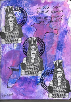
And that led to this art journal page. I took a few of my stencils and sprayed ink patterns on the page. Then I took pages from a book and tore them into small strips, and glued them on to the page. (Dina Wakley's gel medium is great for this. And remember, use a pallet knife to do this because if you use a paint brush, you will never get the gel medium out of the brush.) The gel will pick up the color of the ink and spread it around which creates a really nice look I like. Yet the ink stenciling stayed in place. Nice.
When that layer dried, I added two of Dina's paint colors. I used the purple and magenta colors, then I took my mask of the bird and put it on the glop of paint, and with a baby wipe I cleared away the paint around the mask.
After that, I knew I needed something more than just my three stamped images. I chose the circle stamp to represent the world, or whatever world we each live in (lol), and stamped it right onto the page. I took my three images of the girl stamp and arranged each one so it looked like she was passing in front of the world. As queen, she eclipses the world because we are all a bit self centered. I sort of lost the bird images in the background because mixed media art is an additive and subtractive process, so you loose some images when you add others. However, I could still sort of see the outline of the birds, so I took my Foode Ball pen and outlined the birds. I'm not sure if they add or subtract from the page as a whole. In the midst of it all, the human spirit flies on. That's what the birds make me think of.
I guess CHA 2015 videos inspired me to do some new work. Not only that, but I can't wait for the new Dian Reavley and Dina Wakley stamps, inks, paints, and stencils come out!
Back to art journaling Sunday, Nov. 16, 2014
Planet Marshmallow Monday, Nov. 6, 2014
abstract in compliments Wednesday, Oct. 22, 2014
uNIDENTIFIED fLYING mARSHMALLOWS sUNday jAN. 5, 2014
Well, I decided that I wanted to do some drawing again. I am starting off kinda simple because I haven't done much drawing in a while.
I was thinking it might be kind of fun to write a story about unidentified flying marshmallows. :0) Just for the fun of it. I want to mess around with this idea before I actually try to write anything. Just a fun idea to mess with.
I was thinking it might be kind of fun to write a story about unidentified flying marshmallows. :0) Just for the fun of it. I want to mess around with this idea before I actually try to write anything. Just a fun idea to mess with.
LAST cHRISTMAS pAGE tHURSDAY, jAN. 2, 2014
I did this Christmas page yesterday. Now that the holidays are over, I think I am done doing Christmas pages. I think I want to get back to doing other pages. This page has a sentiment on it that says, "Santa, can we negotiate?" At least this page is clearer than the one below it.
I do have a smaller journal that I use sometimes, but I haven't posted anything from that one yet. I am sort of finding by own way of journaling in that one. These pages are done the way Dyan Reaveley does her pages with these stamps. In the smaller journal, I am using stencils more, and some stamps, but I am also using more words in that one. I will try to get a photo of that one up.
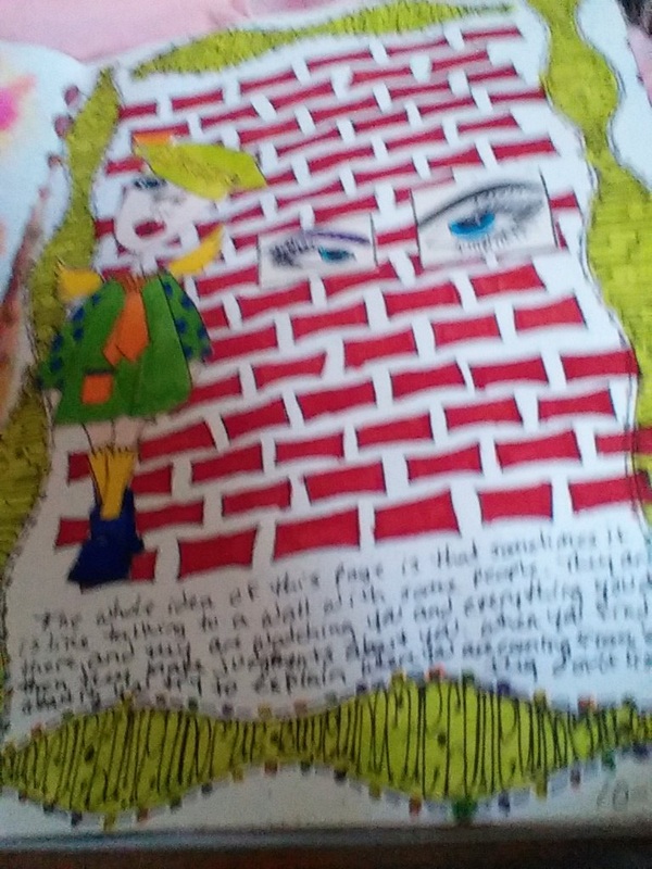
I did this page back in October, I think. I did this because at work there are people who are quiet like a wall, but they are watching everything everybody does, then they make a nasty judgement about you, and then they gossip about what they saw, or heard. That also includes supervisors. My bosses name is Stanley, and this is my version of Flat Stanley. Flat Stanley is wall. Talking to Flat Stanley is like talking to a brick wall. Oh, he's there, but he could care less about your point of view, therefore, talking to him is useless. I try to avoid him as much as possible because I don't like being treated like that.
Friday, december 27, 2013
Wow! This picture came out looking really big! As you can see, I have been trying to add some things to my web page, but my desk computer hasn't been cooperating with me. I got a Kindle HD 7 for Christmas, and it has a camera on it, so, I took this picture with that camera. It's not like a regular digital camera. The camera is on the side where the screen is instead of being on the back of the device like an iphone, or a regular digital camera, so I can see whatever it is I am taking a picture of, but it has to be facing away from me. I can only get arms length away from whatever I am taking a picture of, and this is how they come out. So, basically, I can take a picture of myself, or a video of myself, but anything else will be a little difficult.
Anyway, back to this art journal entry. I have been keeping an art journal since late April of this year when I got interested in actually trying to art journal. I bought a couple of Dyan Reaveley stamp sets, and a few of her spray inks, but I had no idea as to how to use them. I played around with them for a while, then stopped. Then I discovered Dyan Reaveley on YouTube, and I saw her do some demos of how to use here stamps, and spray inks. That's when it all clicked. I remember thinking to myself, 'Oh, that's how you use them!' I got my hands on a Dylusions Journal, and I got started with what I had. The collection of stamps is growing, but it is so much fun to art journal this way that I think it is worth it. As you can see by the pictures down below, I have also been doing Christmas pages in my art journal.
I haven't stopped drawing, I have just been trying other forms of self expression. This has become a more enjoyable way for me to do that. Now that I can post again on my web page using my Kindle, I plan on posting more. The pictures are probably going to look a lot like what you see here, but that's okay. As long as I can share what I create with the rest of the world, then I am happy. That's half the fun of creating artwork; sharing it with the rest of the world.
DECEMBER 22, 2013
I was actually able to take a few pictures of my art journal, and upload them to my page. I used my new Kindle which has a camera on it. It was a little slow, but I got it up. I have been wanting to post more of my art work, specifically my art journal pages. This is what I have been doing since about April of this year. I am still drawing as well, but sometimes it's just nice to try other things. So, these two pages are my Christmas pages, and I included a shot of the cover of my art journal which I haven't done anything with yet. I will eventually.
I was actually able to take a few pictures of my art journal, and upload them to my page. I used my new Kindle which has a camera on it. It was a little slow, but I got it up. I have been wanting to post more of my art work, specifically my art journal pages. This is what I have been doing since about April of this year. I am still drawing as well, but sometimes it's just nice to try other things. So, these two pages are my Christmas pages, and I included a shot of the cover of my art journal which I haven't done anything with yet. I will eventually.
Quote Cards Thursday july 4, 2013
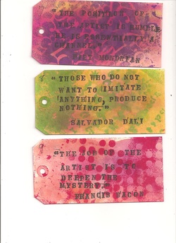
I hate to say it, but this is as far as I got when I was trying to upload my images from my desktop computer. I was able to get the images into the computer, but it is too slow to bring the images up from the computer to the webpage. I spent a couple of hours scanning a few images then trying to upload them to this web page. I just don't have the patcients for that.
Anyway, this is an image of three of my quote cards that I have been making . I have 100 artist quotes that I found on Pinterest, and I wrote them down in a notebook. I thought it might be fun to create the cards out of number 8 tags made by Ranger. When I am done, I am going to put these on a ring and keep them handy for inspiration.
Anyway, this is an image of three of my quote cards that I have been making . I have 100 artist quotes that I found on Pinterest, and I wrote them down in a notebook. I thought it might be fun to create the cards out of number 8 tags made by Ranger. When I am done, I am going to put these on a ring and keep them handy for inspiration.
aRT jOURNALING Tuesday, July 2, 2013
sINCE i DID GET SOME ART JOURNALING DONE TODAY, BUT i COULDN'T SCAN IT AND PUT IT IN MY COMPUTER TO POST HERE BECAUSE i USED sTICKLES ON ONE OF THE PAGES AND i HAVE TO WAIT FOR THAT TO DRY, i DECIDED TO POST A VIDEO OF dYAN REAVELEY AND WHAT SHE DOES WHEN IT COMES TO ART JOURNALING. i HAVE BEEN USING THIS SAME BASIC METHOD FOR ABOUT TWO MONTHS NOW, AND i REALLY LOVE IT!
tHIS IS THE FIRST IN A TWO PART SERIES SHE DID TO SHOW HER BASIC PROCESS FOR ART JOURNALING. eNJOY THE VIDEO!
Been Thinking About Things Friday, June 28, 2013
Here it is again. A huge dry spell where I haven't added anything to my web page. Part of the problem is time, the other part is that my desk top computer where my scanner is hooked up is not working as well as I would like. That computer is so slow that it takes forever to scan and post things on this page.
So, I have been creating art, but just not posting it. This past year at work has been a tough one since I have been having to do most of the work myself because we have been short handed. And, judging by what my boss has said about the next school year, things won't be getting any better. When I came home, most days I was too tired to do much of anything.
This past April, I discovered a new way of making art. I don't always have to draw, and paint. I have been wanting to keep an art journal for sometime now, and every effort I made seemed to fail because I wasn't sure what to put in it. Then I came across Dyan Reaveley and her really cool art journal stamps, and inks, and stencils. I have been watching her videos on YouTube, and I have been learning how to do a lot of new and different things. I have been keeping an art journal pretty steadily for about two months now. That's good! But what good is artwork if you don't have someone or somewhere to share it? That was one of the main reasons for starting this webpage. So, I have decided that since I am producing more art work now, that I need to share it.
I have some art journal entries I have been working on that I want to post here on my site. I have done the backgrounds for four art journal pages so far, and it takes a while for those pages to dry, so I have to split my time up. I spent today working on those pages, and getting my desktop computer working. So, for tomorrow, I am going to get one or two pages done, then get them posted here. I have also been working on some artist quote tags/cards for the inspiration I get from those. I want to post some of those this week end as well.
So, I will be posting tomorrow just as long as my desktop computer is working correctly. Keep your fingers crossed.
Today's Sketchbook Page Thursday, August 2, 2012
I wanted to get back to doing the illustration course with Mark Mitchell, so I am basically adding something to my list of things to do for this. I need to be keeping a sketchbook. I have been watching a number of videos on YouTube where author/illustrators were discussing there books, and the things they have been working on, and I really want to do this, but I have a lot of struggles with staying on task. That's bad.
I tried to do this course a while back, and I stopped because I had an idea of illustrating one of Aesop's fables, but the problem was that the fables were so short, and I was wondering how to get that into a thirty-two page picture book with out rewriting the story completely. I got stuck, so I just let the idea rest while my mind went through all kinds of doubts about what I want to do. I didn't have any ideas of my own, at least none that I thought was any good. So I just stopped.
But then, I saw a YouTube video of Jerry Pinkney talking about his book The Lion and The Mouse, an Aesop fable. I had to get my hands on a copy of this picture book so I could see how he took an Aesop fable and turned it into a picture book. It was really cool, too. He sort of added a few illustrated pages by simply asking a few questions about the story. For example, the original story began with the lion sleeping and being woke up by the mouse. So by asking how did the mouse end up accidentally being where she shouldn't have been and waking up the lion? Pinkney starts with the mouse looking out at the African landscape, and then she heads out to find food. He added about three pages right there, the first two were a spread. Then he shows some detail of the mouse going on her nightly run and stumbling on the lion. One page added there. Then she finds herself on the lion as he wakes up in surprise and roars. Then of course the story goes on as in the fable were the lion was going to eat the mouse, but she begs him not to eat her, and she promises that she will repay him if he spares her her life. He thinks that there is no way a little mouse could ever be of use to him, but he is kind hear-ted and lets her go. Next he adds a page by drawing the mouse going back to her nest where she has a bunch of baby mice. So, why was it important that she be spared? She had the babies.
Next, the lion goes on about his life. The next question comes up. How did the trap get there? Pinkney adds two pages by showing the truck the hunters are in driving along looking for a good place to set their trap. When one is found, he shows them setting up the trap. Then the story goes on as the original story goes, and the lion trips on the rope getting snagged up in a net. He added two pages by first showing the lion walking through the forest, then the next picture is a close up of his feet tripping the rope.
The next two pages are really cool. He shows detail of the mouse hearing the lion's roar, and remembering her promise, she runs to the lion where she finds he is strung up in a net hanging from a tree. She climbs up the tree to where the rope is tied, and begins chewing the rope. The next question is in how many places is she going to have to chew the rope to free the lion? Several. Pinkney shows several pictures of the mouse chewing the rope, so that adds a couple more pages. The lion is freed. The mouse confronts the lion, and then Pinkney adds two final pages where the mouse takes a small piece of the rope she has chewed back to her nest for her babies to chew on.
He didn't change the story. He asked questions about the story because the fable is very short, very brief.
Where does the mouse start out? How does she end up disturbing the lion? How did she go about freeing the lion? Why was it important that she be spared? How did the net get in the forest? Who put it there?
So, I think I want to try an Aesop fable for the illustration course, and I want to try to do it the same way Jerry Pinkney solved the problem of the short fable. Ask a few questions about what is going on in the story, and then illustrate it. It's a pretty cool way of handling the story. When I do mine, the art work won't be anywhere near as good as Mr. Pinkney's art work, but it will be mine.
I saw in the YouTube interview that he had several books on his table to reference the animals he was drawing in the story. I want to keep that in mind. I know that a lot of my art teachers in high school and college said that it was never a good idea to draw from a photograph, but what was Mr. Pinkney suppose to do? Fly to Africa to sketch the animals? Come on! He was working on a deadline, I'm sure. My art teachers failed to tell me was that sometimes it is necessary to draw from photographs as reference because you won't always have certain subjects right in front of you to draw from.
Prompts 2 & 3 Thursday, June 7, 2012
I did a few more pieces of work as a response to prompts 2 and 3. I'm starting with prompt 3 because that is the one I did today. Technically, these prompts are suppose to be done on a daily basis, but I rarely work that way. I do them as I have time, and if I feel like I know what I want to create.
This prompts was to make black and white copies of your own art work, and then cut them up and collage them into your art journal. Tracy mentions that you should go to a copy center to do this, and I think I see why. I did my copies here at home, and they all looked more like a gray scale than black and white copies. At a copy center, they would have been darker. She has a lot of ideas to try, but since I only have until September to get my pages and everything from the website, I don't really have time to try all the ideas. However, I can come back to my pages and try out the other ideas later.
What I really love about doing this kind of art is that it is so freeing. I don't have to worry about how perfect my work is because it doesn't have to be perfect. It's all about having fun with the work, and enjoying the process.
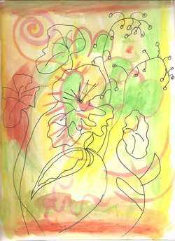
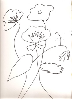
This is my prompt 2 page in my journal. There was actually a couple more that I did that were just line drawings, but since I am having a little bit of a hard time downloading my work onto this page, I'm not sure if I can add them here.
I started out with the line drawings, and then I did a different color palette for this one. I don't want everything I do in this course to look the same by using the same color palette, so I went with an orange, yellow and green palette. Then I drew the flowers on top of the paint. The flowers were taken from a couple of photographs in my workbook. I was to draw them as simply as I could. No exact representations, just simple line drawings showing the shapes I saw in the photo. I did the doodles in paint, then did the drawing on top of that with a fine line black pen. I think it was a Micron pen, or a Prismacolor pen. It came out pretty cool looking, I think.
I started out with the line drawings, and then I did a different color palette for this one. I don't want everything I do in this course to look the same by using the same color palette, so I went with an orange, yellow and green palette. Then I drew the flowers on top of the paint. The flowers were taken from a couple of photographs in my workbook. I was to draw them as simply as I could. No exact representations, just simple line drawings showing the shapes I saw in the photo. I did the doodles in paint, then did the drawing on top of that with a fine line black pen. I think it was a Micron pen, or a Prismacolor pen. It came out pretty cool looking, I think.
This is the first line drawing of the flowers in the photo from my workbook. It is just a simple line drawing showing only the shapes that I saw in the photo.
I did this with a regular Sharpie pen. I don't usually like to use a Sharpie pen because it doesn't seem to matter how think the paper is that you are writing on that the ink runs through to the next page, and the next page after that, and the next page after that, and the next page after that, and so on..... However, a multimedia journal with good paper holds the ink quite well.
I don't know why, but this drawing makes me think of the art work that Matisse did. I think it is because of the simple shapes and lines. He did a lot of art work like that.
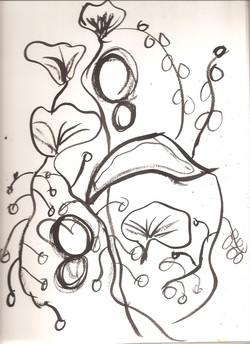
This is another drawing I did for prompt 2. This is actually a combination of flowers from a couple of photos from my workbook. This one is done with India ink and a brush. Actually, I think I started out using a really think brush, and that didn't really work too well for me, so I switched to a little bit thicker brush. That's why it looks like there are two kinds of lines in the drawing. A thin one, and a thick one.
Art Journal Prompt 1 Wednesday, May 30, 2012
I was finally able to get back to doing my e-course. This long weekend has been kinda of hard. Anyway, this is the first piece of artwork I did based on the first prompt in the Inscribed workshop. I stayed pretty much with the same palette, and I used a few marks I had discovered in my art journal. I like the watercolor crayons, they work better the almost anything I have that is water soluble. I did a second piece, but I can't seem to get it to load on here, so I will have to wait and see if I can do that later.
Art Journaling E-Course Saturday, May 26, 2012
I was looking for an art class to do this summer, and I wanted it to be something different than what I have done in the past. I checked with the community college to see if they were offering anything during the day this summer. Of course, they weren't. I found an art journaling course on line that I thought would be fun. I have been wanting to art journal, but I haven't really known what to do, or where to start. This course is by Tracy Bautista-a very cool mixed media artist.
These are just from the first video prompt. She has a color pallet that is in the workbook that you can follow. That's what I did. I watched the video to see how she does things, and get an idea of what to do first. I stuck with the color pallet in the workbook because I want to take some time to find images, and other things with interesting color combinations. I mixed my colors to match as close as I could to what was in the workbook. I think my green is a little more of a lime green than it is a soft pastel green, but I think that is okay. I doesn't have to be exact. I just took my brush, filled it up with a color and started making marks. This is the first page in my journal that I did.
These are just from the first video prompt. She has a color pallet that is in the workbook that you can follow. That's what I did. I watched the video to see how she does things, and get an idea of what to do first. I stuck with the color pallet in the workbook because I want to take some time to find images, and other things with interesting color combinations. I mixed my colors to match as close as I could to what was in the workbook. I think my green is a little more of a lime green than it is a soft pastel green, but I think that is okay. I doesn't have to be exact. I just took my brush, filled it up with a color and started making marks. This is the first page in my journal that I did.
This is the second page I did in my journal. I tried to overlap a few colors here and there, and I noticed a few shaped in the samples in the workbook that I wanted to try. I didn't quite get the right shaped I was trying to get, but still it came out okay. This is just a fun background that I probably shouldn't have dated.
Just like the first page, I loaded up my brush and started making the marks. I had to re-mix my colors because I was running out of paint each time I finished a page.
Just like the first page, I loaded up my brush and started making the marks. I had to re-mix my colors because I was running out of paint each time I finished a page.
This was the last page I did, and it is my favorite. I wanted to make some marks with my brush that would give the idea of flowers. I smooshed the brush out in a radial direction three separate times using each of the three colors I selected.
Once again, I noticed some marks in the sample that I wanted to try and mimic. That would be the swirly lines running through out the page. This was a fun exercise, and it was all I had time to do today. I hope I have enough time to do more tomorrow. If not, definitely on Monday. We are having our Memorial Day cookout tomorrow instead of on Monday. I will have some things to do tomorrow.
I wanted to work with the second video jump start, but I didn't have time, and I don't have anything like water color crayons. I want to try those, and see if I like working with them.
The Creative License Sunday, May 20, 2012
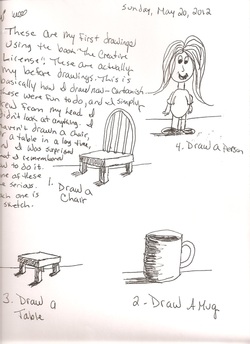
I have been thinking a lot about my artwork lately. I was actually thinking about the Sketchbook Project, and I started to wonder if I really wanted to do a bunch of cartoons again. I have said before that drawing from life basically bores me, but I have been reading from a couple of books the last few days that might make me change my mind about that. I noticed that there is a new edition of Drawing on the Right Side of the Brain on the bookshelf at Barnes and Noble. I bought the first edition of that book years ago when it first came out, and I spent a summer working through it, but as soon as it came to doing portraits, I stopped, and put the book away. There have been numerous new editions published since then, and every time I pick one up and look at it, all I can think of is how wordy it is. I mean, its a good book, but for a drawing book, there sure is a lot of reading. I'm just not sure I want to try to go through that book again. I know it's suppose to be one of the best books out there on drawing, but I want to work on learning to draw properly, not read about drawing properly, and having to do things a certain way because the book says to do it that way. I don't particularly care to "tone" my sketchbook page just to do a drawing, and I don't want to have to use a view finder, or grid to draw with either. I want to draw, not get technical about drawing.
I went through all of my books, and I found one that I bought a few years back. It is The Creative License by Danny Gregory. I started to read it, and then I remembered that he shows you how to do the same kinds of drawings as Drawing on the Right Side of the Brain, but not as wordy, or technical. He gets to the point, and simplifies the contour drawing. I decided that since we only have three days of school left until summer vacation, I would go ahead and start being proactive with that book. The first thing you do-as always in some drawing books-is the ever popular before drawings. So, that is what this is.
The first thing was to draw a chair, then a mug, then a table, then a person. I never looked at anything from real life to do these drawings, I just drew what I knew how to draw to make a chair, a mug, a table, and a person. Most of what I draw is pretty cartoony because that is what I have been doing for a while now. But I think I need to learn to draw from life. Or at least get into the habit of drawing from life. I noticed that when I draw from life here at home, I hate the subject matter, and it bores me. However, anytime I have ever gone to the park to draw, I enjoy it more and I don't feel bored. It has been said that artists all down through history have drawn the world around them as way of understanding it. What is at home is boring, and I see it every day, and there really isn't anything to understand, but go away from the house and sketch something else, then it is more interesting. Drawing from life doesn't bore me as I have always thought, but trying to draw things that are here at home, the things I see everyday, does bore me. And trying to draw people? Don't get me started on how horrible my drawings of humans are. People are hard to draw, and hard to understand, so I guess it is pretty easy to get a distorted view of them as humans as well as in drawings. I'm not much of a people person. Never have been, and I guess I never will be. My sister has always been the people person in the family. The phone practically grew out of her ears when she was a teenager. I always hated that. To this day, I still hate to talk on the phone for very long. As far as my cell phone goes, I have one, but it is always turned off, and I don't give the number out to anyone. My sister makes fun of me because I still dial the phone numbers instead of using the phone book. Too many buttons! Stupid thing sounds like a cricket chirping, and when I hear it, I just want to go stomp on it with my shoe. SMASH!! Oops, that wasn't a cricket. That was my cell phone. Oh well, I guess I won't have one now. Maybe I should draw a picture of my cell phone. BORING!!!
First Pyramid Painting Saturday, May 5, 2012
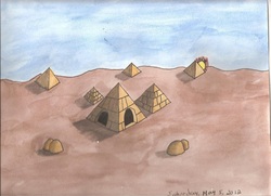
I haven't put anything in the actual sketchbook for the Sketchbook Project yet because I am still learning and experimenting with drawing things from Ancient Egypt. I did this painting after I did the first lesson on the computer, and I played around with it a little in my regular sketchbook. I am basically trying to get the feel of drawing these things because I have been drawing a lot of ocean scenes for this year's sketchbook project, so now I am doing a switch.
I was using another kind of watercolor paints that I really liked except they are very guachey when they dry. So much like gauche that you can actually get some of the pigment on your hands when you are holding the sketchbook and flipping through the pages. And it smudged on that book as well. I loved the color in the Art Fundamentals watercolor box, but I just can't deal with the smudging since the sketchbook is going to be handle by other people.
These paints that I did this painting in was from a new box of watercolors that I picked up at Hobby Lobby for like eight bucks. They are Yarka watercolors. I wasn't real sure about these because they were made in Russia, and imported into the United States and I wasn't sure if they would like right. They said on the packaging that they are transparent watercolors, and I thought, oh, that might why the other paints smudged. They aren't transparent watercolors. They are probably a gauche. On the package for the Art Fundamentals paints it doesn't say if they are transparent or gauche. Gotta watch that.
I was really surprised by the Yarka paints. They are a semi-moist paint-like Prang-only not as many colors as you can get with Prang. And they are about four dollars less Prang paints. I like Prang even though that is what we had to use in school as kids for art class. The old stand-by, I guess. But the Yarka paints are pretty good. I got some colors from it, and it doesn't feel smudgy after they dry. I might use those in the actual sketchbook that I have to send back. I haven't decided yet. At least I have started now.
My First Art Journal Page Sunday, September 24, 2011
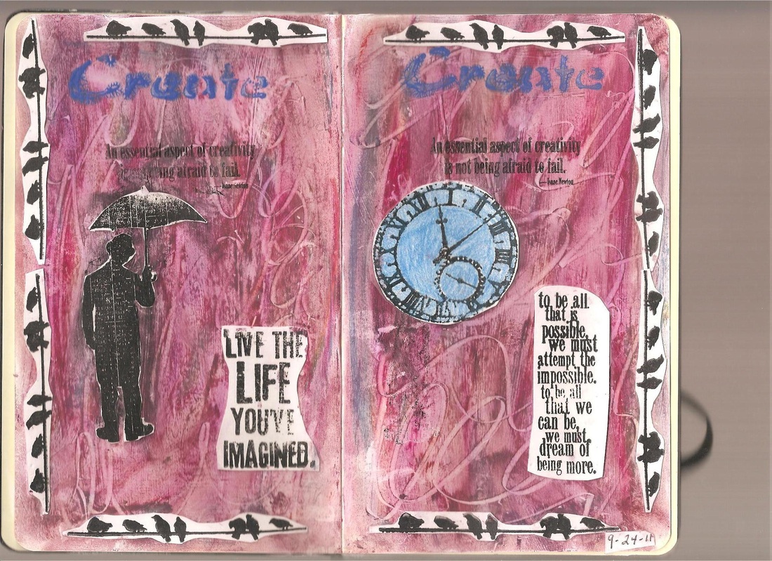
I can't believe I haven't put anything on my web page in nine months! I have had a hard time getting anything done all this time. It just seems like time escapes me. I go to work, and I come home and I tend to to be too tired to do much of anything. But that really isn't a very good excuse.
That is what brings me to this art journal page. It is all about excuses for not making art. I am using a Moleskine sketchbook as my art journal, and I first wrote down all the excuses I have for not making art. I listed them on both of these pages. Then, I layered some gesso on top of that, and I let that dry. That was like saying goodbye to all the excuses. They are there, but the art work takes over. After the gesso, I took some oil pastels and just scribbled all kinds of marks on the two pages. I picked my colors at random. Then I just smeared them around with my hands to create the look you see here. After that, I took a bull clip and used the metal clip to create swirls all over the page. I tried to stencil in the work 'create' in blue acrylic paint at the top of each page, but that didn't work out as well as I had hopped, but I kept it on there anyway since the 'happy accident' might be what I end up liking the most about the work. After trying to stamp the images on the oil pastel-it didn't work-I stamped them on card stock, and cut them out, then I Modge Podged them to the page. The quotes were done the same way except for the quote at the top of both pages. Rubber stamps will stamp onto the oil pastel, but the clear stamps won't. I don't know why that is.
The idea was from a Youtuber named Suzi Blu. She is great! I am taking two of her online classes, and one of them is for an art journal entry. The first assignment/lesson felt like more than I could do because it deals with doing portraits. I'm not that confident of my skills yet to try that, so I used an older idea that Suzi had on Youtube where you write down all your excuses for not making art, and create a journal page around that. That idea felt more comfortable to me since I have never really kept an art journal before.
Why the drastic change from my usual art work? I have been reading about art journals and how to keep them, and I have been learning about mixed media artists, and I love the work they do. Most of what I have been reading, and seeing is from Somerset Studios magazine. I love the look of the mixed media art work I have been seeing, and I wondered if I could do art work in that style. I am kinda tired of doing the same kinds of drawings, and I want to go into a different direction with my art work.
The meaning of these two pages is this: there are always excuses to not make art, and they will come raining down on at any time, but to live the life you imagined for yourself as an artist, you have to look beyond the excuses and get busy. Never be afraid to fail. Never be afraid to go ahead an create when you are tired, or overworked, or just didn't have time, make time, because time is running out. It will pass whether or not you do the work in art work, so you might as well get to it even if you think you don't have time, or you get busy. Get to it as soon as you can and see what happens. Actually getting in there and doing the art work will chase the excuses away.
KAPOW! Thursday, January 13, 2011
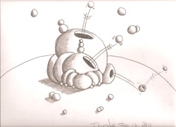
Time to move on to something other than lined up spheres. The planet Plutark just blew up!! (lol) It's spawning little planet Plutarks!
I wanted to add a new picture with movement in it, and this is what I came up with.
I wanted to add a new picture with movement in it, and this is what I came up with.
Spheres With Doors and Window Wed. January. 5, 2011
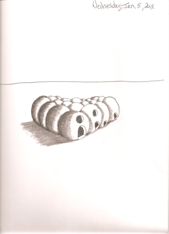
I know this is basically the same picture I did the other day, but I wanted to see what these would look like if I added doors and windows. I am using too much pencil lead when I shade. It is suppose to be darker near the edge and then get lighter as you go towards your hot spot. I had a hard time doing that because I used too much pencil. I need to lighten it up a bit.
Shaded Spheres Monday, January 3, 2011
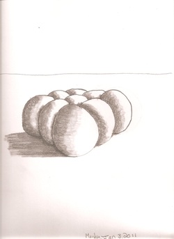
I know it has been a long time since I posted anything on my web page. I recently found a book by Mark Kistler that is very similar to the books he has written for kids, but this is the first one has written for adults.
One of the first things I have been learning is how to draw and shade spheres. I did this drawing this evening, and I am going to work with this a little more and see what else I can come up with.
One of the first things I have been learning is how to draw and shade spheres. I did this drawing this evening, and I am going to work with this a little more and see what else I can come up with.
I Can't Draw Humans Thursday, August 12, 2010
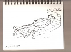
And this is why I rarely if ever draw from life-especially humans. I tried to draw Dad while we were watching Jeopardy, and I just couldn't get it right. When I draw from life, I feel like I am missing something, and then the drawing comes out looking crummy. I know, I know, I should be drawing for myself, but I really wish I had some idea of how to make a sketch look even remotely correct. They say the more you draw the better you get at it. So far, I'm not convinced. The more I draw form life, the more discouraged I get about drawing from life. I think this is why I prefer drawing cartoons.
A Kingdom With a Flag Monday, July 26, 2010
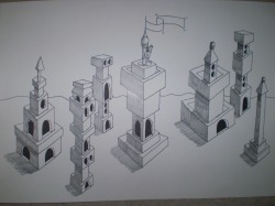
Getting a little fancier! (lol) I put my little character into a kingdom and I gave him a flag. This one was more fun to draw because I was drawing some new things I haven't drawn before. I want to keep drawing and keep tying to draw new things in my pictures because I am not where I want to be with my drawing just yet. I have to keep working on it.
Swinging From Bending Towers Wednesday, July 21, 2010
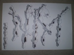
I wanted to post this last night, but it wasn't finished. I finished it today, so this one really took me two days to do. I wanted to draw something fun, so I went with this idea of these little guys swinging around on these bending towers. I know I have done this kind of drawing before, but I wanted to add a few little characters to the picture this time.
I Felt Like Cartooning Today Monday, July 19, 2010
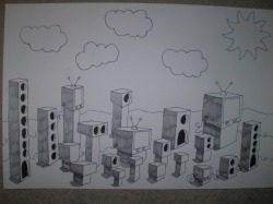
I know, I have done this before, but I felt like drawing some kind of cartoon today. I have drawn these buildings before, but this time I gave them a sky with a sun and clouds. I thought about doing it in colored pencil, but I really wanted to keep it simpler than that, so I just did it in black and white.
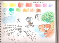
Sketching In the Park Wednesday, July 14, 2010
I did something I have been wanting to do for the whole summer. I finally went to Antioch Park and did some sketching today. Since I am trying to get into the habit of sketching from life, so I went to the park and decided to try and sketch a few things that I found there. I was hoping to find more people at the park, but because of the excessive heat warning that we are under, not many people were at the park today. The heat index for today was 105 degrees f. to 112 degrees f. That is hot! Even though I was sitting at a pic nic table under the gazebo, it was still a little too hot for me, so I didn't stay long. I did this one page, and headed home. I tried to draw a couple of people, but it was slim pickings. I don't draw people enough and I wanted to get some practice in. Maybe I should have went to the mall today. I bet that's where everybody was since it is nice and cool there.
Since I made an effort to do something I have been wanting to do, today has been a good day. I have discovered that when I stay in the house for too long-days at a time-I tend to get very depressed, then I don't want to do anything-let alone draw or paint. Just being sick for a good six weeks is depressing enough! I did get a little tired when I was in the park. My body felt like it was dragging while I walked around, and I got winded a little sooner than usual. As soon as the heat breaks, I want get back into the habit of going for my walks in the park again. I know I will feel better when I get back to doing that.
Since I made an effort to do something I have been wanting to do, today has been a good day. I have discovered that when I stay in the house for too long-days at a time-I tend to get very depressed, then I don't want to do anything-let alone draw or paint. Just being sick for a good six weeks is depressing enough! I did get a little tired when I was in the park. My body felt like it was dragging while I walked around, and I got winded a little sooner than usual. As soon as the heat breaks, I want get back into the habit of going for my walks in the park again. I know I will feel better when I get back to doing that.
Time to Get Back To Drawing Sunday, July 11, 2010
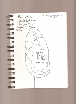
Finally! I have spent the last six weeks being sick with a bad sinus infection and a bad case of bronchitis, and I haven't really felt well in a long time. I am feeling like myself again so I am ready to get back to drawing and painting. I started the illustration course a while back and I want to start over because my illness kept me from doing much of anything. I did have time to think about things, and I have also decided to start doing more drawing from life in my sketchbook. I don't do enough of that, and to illustrate for children's books an artist needs to be working from life not just the imagination. I know this isn't much, but this is a contour drawing of my KC Royals hat that my father gave me a year or so ago. I have just been wanting to draw it. I think I need to get my watercolors out and work those as well, and I need to get back to the illustration lessons this week.
That was my plan for my summer break; I was going to spend as much time as I could working on my artwork, and the illustration lesson, but I ended up spending the first six weeks of my time off sick, so now I am going to try and salvage the rest of my break and get as much done as I can.
That was my plan for my summer break; I was going to spend as much time as I could working on my artwork, and the illustration lesson, but I ended up spending the first six weeks of my time off sick, so now I am going to try and salvage the rest of my break and get as much done as I can.
Bookbinding Thursday, April 29, 2010
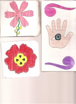
Wow! I haven't gone so long without putting something on my web page! I have had some stressful things going on in my life lately, and I haven't really felt like or wanted to do any artwork. I sort of got stuck for awhile and felt like I had no new ideas or anything. I started reading some books on keeping an art journal, and I got an idea to create a sketchbook.
This picture shows the three books I have been working on the past few weeks. The long book with the hand and eye on it was the first one I did. I gessoed the front and back covers, came up with my design, put it on the front cover, then I bound it together with white ducttape , measure out my pages, cut them out, folded them and glued them together, then glued them into the covers. When the bookbinding glue dried, I had a new sketchbook. The covers for that one are two pieces of chipboard that I bought at a The Scrapbook Page here in my neighborhood. I went in there looking for some inspiration because I was feeling depressed abut not getting any artwork done for such a long time. When I swaw the chipboard, I got the idea to try and bind a sketchbook. After I got started on that, I began to feel good again because I was createing something different. I think that sometimes when I get into an artistic rut, I need to find something different that I haven't done before to pull my self out of the rut.
The second book I did was the smaller one with the pink flower on it. This one didn't come out quite as well as I had hoped. I folded the pages like I did for the first book, but I think I put too many of them in the covers because the pages are sort of hanging out of the edge of the book. But what I did different this time was I bound the covers with the tape first, put gesso on both sides of the covers including the tape, let it dry, then put my artwork on the cover, then I put gel medium all over both sides of the covers to seal it, then I put the pages in the same way I did for the first book. It still wasn't quite what I wanted it to look like, but I was almost there.
The third book with the red flower on it was much closer to what I was trying to do. By the way, the covers for the smaller books are these little square coasters that you can get at The Scrapbook Page. I taped those together, put the gesso on both sides including the tape. Then instead of folding the pages, I cut a bunch of single pages out, stacked them together, and brushed on the bookbinding glue on one side of the pages. While that was drying, I worked on my cover design. When I go the design on there, I used gel medium to seal both sides of the covers. After that dried, I brushed the bookbinding glue into the spine of my book, and I put some more on the glued together pages, and then I put them in the binding, pressed it for a few minutes, then put a rubber band on it to hold it together until it dried.
This last book works really well. I have drawn a few pictures in it to get a feel for it. I guess you could say that these were basically trial runs on how to bind a book. The next one I am working on now is going to be the actual art journal. I am making it out of two cheap tablets of drawing paper from Michael's, and it is going to have a paper doll them on the cover. This one I plan to use as an art journal where I can draw, collage, cartoon, write in it , or whatever I feel like doing at the time. When I am finished with that, I am going to make a sketchbook just to draw in. That cover will be hand drawn.
All in all, this was pretty fun to do.
Sailing (Computer Art) Sunday, Feb. 21, 2010
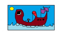
Okay,this is getting a little silly, I know. I just don't know what I want to draw. I am starting to feel a little lost with my art. I need to get down into the studio and get some actual drawing done and get it on here. This is another little computer doodle I did on the computer. I don't think I should do too many more of these silly drawings. I need to get busy.
The Mosaic Fish Thursday, Feb. 18, 2010
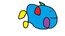
I have been feeling sort of stuck lately because I haven't done any drawing lately. I sat down at the computer and got into the paint program and played the scribble game. I took my mouse and just doodled a shape out then I decided what it was. I came up with a fish. My thinking is that if I can just sort of doodle a little here and there maybe I will feel lose enough to actually try to draw something.
A New Year With New Drawings Monday, Jan. 18, 2010
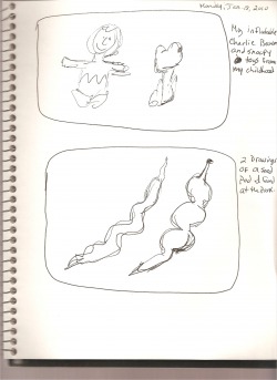
Happy New Year to everybody! I got a little off my schedule becasue of the holidays, but I think I am back on track again. The holidays are so busy! I posted here some of the things I did manage to get done over the Christmas break, and a few things I did tonight. The top square of this entry is of two toys from my childhood that I keep in my studio for fun and decorations. They are Charlie Brown and Snoopy dolls. The second square is of a seed pod found out on one of my walks this past fall. I have to admit, I think that my scribble drawings aren't really all that great. I feel like I have to be able to tell what it is that I am drawing, but scribble drawing isn't suppose to be easily recognized, so I need to keep at this. I am sort of stuck on lesson three because I don't have a story to work with yet. I am still looking for one. I feel like I can't move on until I have a story to work with. But at the same time, even though I am doing scribble drawings, I feel like I am not getting much done artistically. I feel a little stuck right now, and I need to get unstuck. I'm just not sure how I am gonna do that yet.
Two Views of Girl Praying Monday, Jan. 18, 2010
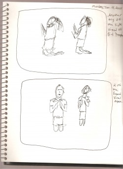
I wanted to try again with the praying child. I like my first attempts better. I am finding that this kind of subject matter is hard to draw when you don't usually draw it.
Little Girl Praying Monday, Jan. 18, 2010
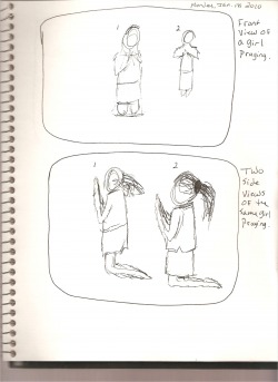
I happened on a book called Virtual Pose Children and Teens at the used bookstore this weekend, and I thought I would try to go a different way with my scribble drawings. This is two views of a little girl praying. I don't generally draw people bacause I am so bad at it, but I am going to have to learn how to draw people sooner or later if I am going to illustrate. In the top square, I like the first drawing better, and in the bottom square, I like the second drawing the best.
Stuff In My Studio Monday, Jan. 18, 2010
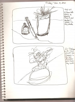
These are just a couple of things that are sitting on my table next to my drawing board. The air freshener with the scent sticks was a Christmas gift from my sister. That one came out pretty scribbly.
My Desk Chair Monday, Jan. 18, 2010
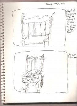
I decided to try and draw my desk chair again, but I drew the first one to big. I was trying to get the whole chair into the square. The second one was much better.
My Hot Chocolate Mug Monday, Jan. 18, 2010
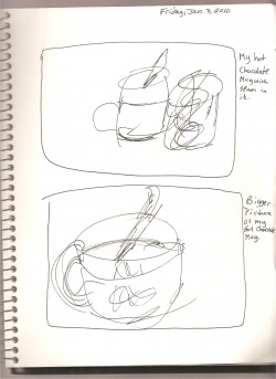
I tried to draw my hot chocolate mug twice in the upper square, but the second one really wasn't happening for me, so I scribbled it out. I like that I made the second drawing bigger because my mug is big.
Snail and Owl Monday, Jan. 18, 2010
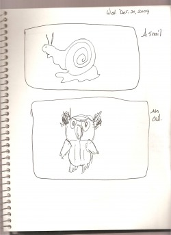
This is a snail statue that I have in my studio. He is all white, and kinda heavy. I wanted to see if I could draw him at all. This came out okay. The second drawing is a little stuffed owl that I found at the craft store. I thought these might be fun little characters to add to Tinsel's little world.
Wheelbarrow Monday, Jan. 18, 2010
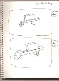
I tried to draw this little wheelbarrow two separate times. I think I like the second one better.
Dresser With A Mirror Monday, Jan. 18, 2010
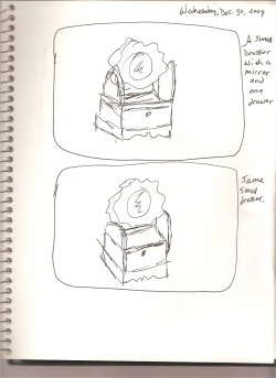
I realize this has been a good month or more ago, the holidays messed me up on my drawing and getting things done, but I think I am back on track now. Anyway, I found a few other things that I wanted to try and scribble draw. This is a little dresser with a mirror on it and one drawer.
Two New Views of Sammy Thursday, Dec. 10, 2009
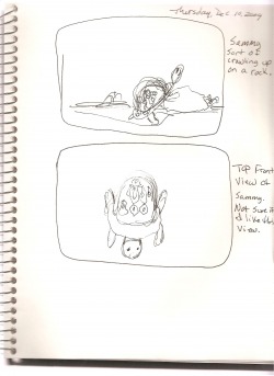
I decided to try two new views of Sammy. The first one is Sammy climbing onto a rock, and the second one is just a to front view of him. I'm not sure if I really like the top front view of him. I want to do some more drawing this evening and then get them posted here on the web page.
A New Revelation About Sammy Thursday, Dec. 10, 2009
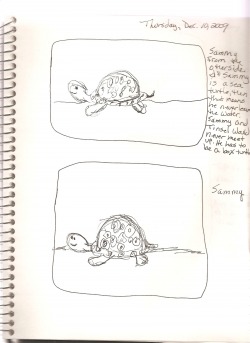
While I was working on Sammy, I realized that he can't be a sea turtle because if he is going to have anything to do with Tinsel the mouse he has to be a land turtle. Sea turtles never leave the sea. Except the female will leave the sea to lay her eggs, but that's about it, so Sammy is going to have to be a box turtle.
Gesture Drawings of Sammy Thursday, Dec. 10, 2009
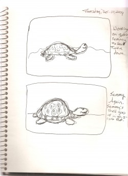
These are the first gesture drawings of Sammy the Sea Turtle. Basically, all I am trying to do here is get him down on paper.
A New Character for Tinsel Thursday, Dec. 10, 2009
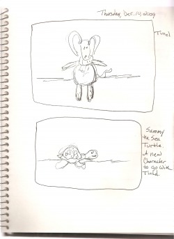
Just to get started, I did a gesture drawing of Tinsel. I have recently been out looking for some new little characters to put with Tinsel. The first one is a turtle named Sammy. I think he is going to be a cute little turtle that lives in the woods near Tinsel. I haven't quite decided yet what I will do with him.
He Was Me Saturday, Nov.28, 2009
Here is a video by one of my favorite author/illustrator. It's about remembering the child within each of us and maybe giving in to the dreams we had when we were young. I hope you enjoy it.
New Views of Tinsel Saturday, Nov. 28, 2009
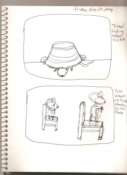
Here are two new views of Tinsel. I thought he might look cute if he was under the washtub instead of in it or on it. I tried to draw him standing on the washtub, but the first attempt was too small and I had enough room so I did it again only larger. I wish I had gotten more drawing done this weekend, but even though it was a long weekend, there was still a lot to do for the holiday.
I moved on to lesson three in the illustration course. I have three options. I can find a story and write and illustrate it, or I could pick something from my own life and write and illustrate that, or I can come up with a cute little character and create a story for him/her. I want to the last option. That is going to be my class project. The problem is that I don't have a lot of story ideas in my head. This is the part of the project that is going to be hard. This part of the project is going to take some time to do. I definitely want to do a story around Tinsel, but i just don't know what the story will be yet. I thought maybe a Christmas story, but maybe not. If I am going to be working on this past Christmas, then I'm not going to want to write a Christmas story come spring and summer. It probably isn't a good idea to go with the holiday spirit right now. I have to draw a lot more, and start writing some ideas down. I'm doing anywhere near as much as I want to do. There has been a lot going on with the holiday this week. I am running out of drawing ideas for Tinsel. I have to do bunches more drawings of him, so I better rethink what to draw.
I moved on to lesson three in the illustration course. I have three options. I can find a story and write and illustrate it, or I could pick something from my own life and write and illustrate that, or I can come up with a cute little character and create a story for him/her. I want to the last option. That is going to be my class project. The problem is that I don't have a lot of story ideas in my head. This is the part of the project that is going to be hard. This part of the project is going to take some time to do. I definitely want to do a story around Tinsel, but i just don't know what the story will be yet. I thought maybe a Christmas story, but maybe not. If I am going to be working on this past Christmas, then I'm not going to want to write a Christmas story come spring and summer. It probably isn't a good idea to go with the holiday spirit right now. I have to draw a lot more, and start writing some ideas down. I'm doing anywhere near as much as I want to do. There has been a lot going on with the holiday this week. I am running out of drawing ideas for Tinsel. I have to do bunches more drawings of him, so I better rethink what to draw.
Nothing Really New Here Saturday, Nov. 28, 2009
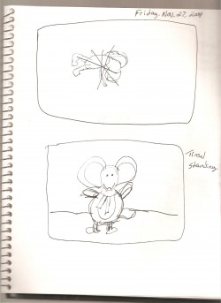
I wanted to try and draw Tinsel head first in his washtub, but that really didn't quite work. I decided that I really wasn't to fond of the idea of putting him head first into the tub. So, I just did another view of him standing.
Two Views of Tinsel Saturday, Nov. 28, 2009
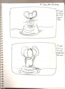
These are two new views of Tinsel. I drew him sitting on his washtub, and then I decided to draw him from the back.
Other Objects Monday, Nov. 23, 2009
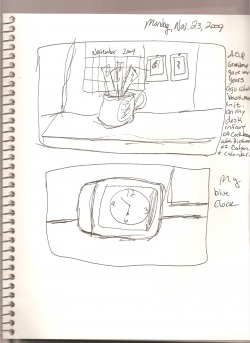
I decided it was time to draw some things from around me as well as Tinsel and his furniture. The top picture is a tea cup that grandma gave me years ago. It was from her china cabinet and I really liked it that was why she gave it to me. I just use it to keep bookmarks in now. The bottom picture is my blue clock in the studio. I tried to add a few things that were hanging on the bulletin board in the top drawing and the bulletin board in the bottom drawing.
Tinsel Looking For Something Monday, Nov. 23, 2009
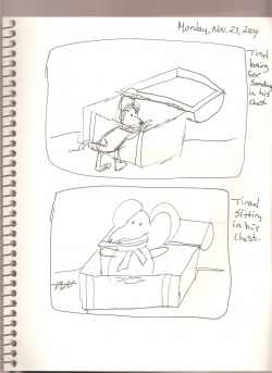
I tried to pose Tinsel as if he were looking for something in his chest. That's the top drawing. And decided that was harder than I thought it would be, so I need to work drawing Tinsel in different poses and situations to get it right. The bottom picture is Tinsel getting so frustrated with trying to find whatever it was he was trying to find, that he got into the chest to look around for his lost item.
New Idea! Monday, Nov. 23, 2009
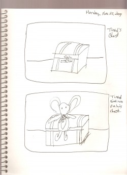
I tried the chest again hoping to get a more relaxed feel of a drawing, but it still felt stiff. Then I had an idea. Why not draw Tinsel along with his furniture? The bottom drawing is Tinsel sitting on his chest. Both of these are still stiff feeling to me.
Tonight's Drawings Monday, Nov. 23, 2009
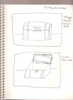
I was trying to draw both of these drawings from eye level, but because I haven't drawn in a while it felt stiff and forced. I need to draw more often to keep that stiff feeling from coming into the picture.
Faster Gesture Drawings Monday, Nov.23, 2009
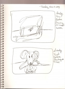
I wanted to draw the gesture drawings faster, so I did the chest really fast and it looks really flat. Then I did a gesture drawing of Tinsel really fast to see what I could come up with.
Tinsel In Motion Monday, Nov. 23, 2009
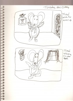
After I did the front view of Tinsel, I decided that he needed to be active in some way. I had to try and imagine his foot being in the air in the bottom picture because you can't really pose his arms and legs. He isn't made that way. I need to do more gesture drawings of Tinsel in motion.
Tinsel In Two Poses Monday, Nov. 23, 2009
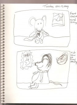
I got kinda tired of the furniture, so I decided to try and draw Tinsel a couple more times. Again, I was trying to get a feel for the little guy. The bottom picture is of Tinsel standing in the other direction from the last time I drew him in profile.
Tinsel's Furniture Again Monday, Nov. 23, 2009
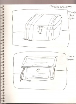
Okay, this is a little repetitive since I drew these two items once already. I drew them again because I wanted to get the feel for both objects. I wanted to try to draw again to see if I could get a better feel for them.
Tinsel's Furniture Monday, Nov. 23, 2009
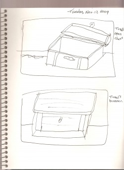
Top picture is a gesture drawing of Tinsel's chest opened up. This was kinda hard to draw, but I tried not to think too much about how it was suppose to look. It really should be more like a note to remind myself of what I saw and what I might do with it later. The bottom drawing is a one drawer dresser that I got at the same craft store. It is small like the chest so I can pose Tinsel around it and the chest to draw him.
Tinsel Sitting On My Printer Monday, Nov. 23, 2009
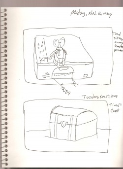
This is a gesture drawing I did about a week ago, and I got busy doing other things and didn't get it posted until now. I just sat Tinsel on my computer printer and thought he looked kinda cute sitting there, so I did a gesture sketch of him there. The second picture is a small chest I picked up at a craft store for a dollar. It's small and it is just the right size for Tinsel, so I made this his chest. What he has in it I haven't decided yet.
Tinsel's Wash Tub Sunday, Nov. 15, 2009
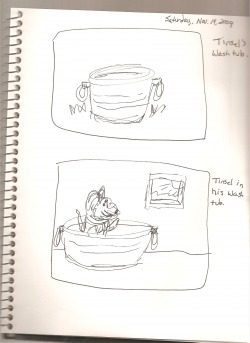
I found this little metal wash tub in a bag of things I had put in the studio and forgot about. I came across it last night while I was looking for something and I thought it was big enough to add to my Tinsel stuff. I picked it up at Michael's last spring when I was trying to find some things to draw. I think I paid something like a dollar and a half or two dollars for it. It was big enough to put Tinsel in the wash tub as if he were taking a bath. So, I put him in there and I did a gesture drawing of it. He's taking a bath in his wash tub.
Tinsel Sitting In His Chair Sunday, Nov. 15, 2009
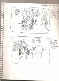
These two drawings were the most fun to do so far. I put Tinsel in the chair, but the chair really is too big for him, so I had try to scale it down. After I drew him in the chair I thought of a door, a lamp, and a window to add to the top picture. In the second picture I added the table with some food on it and Tinsel sitting at the table ready to eat. Again I thought of the door and window after I did the drawing of him at the table. I think these two are my favorite one so far.
Oooppssy! Sunday, Nov. 15, 2009
I wanted to try the chair again because I wasn't real happy with the way the first two drawings came out. The top drawing I boogered up then crossed it out. The second one isn't any better than the first two drawings I did on the previous page. Oh well. Move on.
Tinsel's Chair Sunday, Nov. 15, 2009
Last Sunday, I went to an antique mall with my sister and my niece. While I was there I found a small table with two chairs and two teddy bears sitting in the chairs. I bought it thinking that I could maybe do some drawings of it with the bears. While I was drawing Tinsel, I thought that he might need a chair to sit in. I drew it from the front first then the side.
Tinsel the Mouse Cont. Sunday, Nov. 15, 2009
I keep wishing that I had more time to sit in the studio and really work on my illustrations, but I have to work to get paid so I can buy art supplies so I can do my illustrations. Last night, I sat in the studio and I got some work done with my gesture drawings of Tinsel the Mouse. I think I would like to write a story about him, but I don't have a story in my mind yet, just the idea that would like to write one about him. I started out doing a couple of gesture drawings of Tinsel sitting. Then I thought about what he would look like if he were in his bed sleeping, and that is what the second drawing is.
The Very Hungry Caterpillar Tuesday, Nov. 10, 2009
Here is another video of a classic picture book. Hope you like this one.
The Picture Book Template Tuesday, Nov. 10, 2009
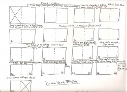
Lesson two was loaded with the history of children's picture books. Then I drew my own picture book template showing how a picture book story is blocked out. And how the story moves along on the pages. Next up is to go to the library and get my hands on some picture books and look at how they are actually printed out. Where is all of the things on my template in this book or that book? And to understand this, you have to go back to what you learned about story writing. Your main character has to have struggle or problem to work through and he needs to come out of it changed either emotionally or physically.
Tinsel the Christmas Mouse Tuesday, Nov. 10, 2009
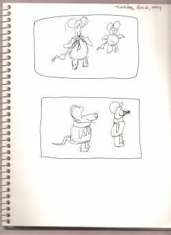
Enter a new little character, Tinsel the Christmas Mouse. Tinsel is looking for the real meaning of Christmas. Or he may be looking for Christmas joy and happiness. I haven't decided what I'm going to have him do yet. Now I have two fun ideas to play around with!
Madeline Poses Tuesday, Nov. 10, 2009
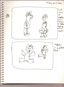
These are just some random poses of Madeline I did for fun. What would she look like if she was so happy that she jumped in the air? What would she look like if she were standing on one leg? And a side view of Madeline, and Madeline looking for something to draw/paint in her sketchbook.
Madeline's Easel Tuesday, Nov. 10, 2009
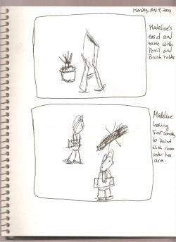
I wasn't real happy with the easel I did in the previous picture, so I tried to get a better idea of what a simple easel would like by just drawing it as simply as I could. I like this one better. The bottom picture is Madeline with her sketchbook looking for something to draw/paint.
Watercolor Box Tuesday, Nov.10, 2009
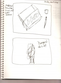
The top picture is obviously Madeline's watercolor box (more artist materials) and the bottom drawing is one that I screwed up. I didn't have anything in front of me when I began to draw and this is what happened. I really need to have something to work from until I get to know it better then I can draw it from memory.
Madeline at Her Easel Tuesday, Nov. 10, 2009
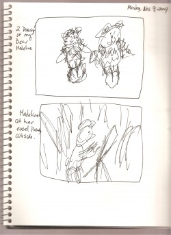
I did two more doodles of Madeline Bearcasso, and then I decided to give her an easel. So I tried to show here doing a painting, or drawing. If she is an artist bear then she needs to have some art materials.
Two Bottles and Fan Tuesday, Nov. 10, 2009
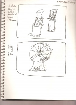
These are just a couple of things I have around the studio. My fan isn't getting used as much since the weather is cooling down.
Madeline and Water Container Tuesday, Nov. 10, 2009
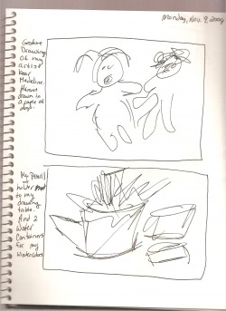
These are two sketchbook entries I did yesterday evening of Madeline Bearcasso and my pen/pencil holder and water containers. I ended up having a busier weekend than I had intended and I didn't get any drawing done. I sat down in the studio last night and got a bunch done. I'm still working on the gesture drawings and learning to basically take notes with my scribble drawings. They look like scribbles because they are scribbles.
My Pillow and the Wild Thing Friday, Nov. 6, 2009
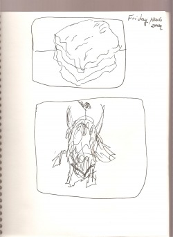
The top drawing is just my pillow on my bed. The bottom drawing is the wild thing stuffed animal that I picked up at the bookstore last week. Now that Maurice Sedak's book "Where the Wild Things Are" is a movie, they are selling the little characters in bookstores. When I was in first grade, we got to bring home the Scholastic Book Club flier that our teacher handed out to us once every month. We had just moved to Kansas from Indianapolis that summer and this was my first time getting to pick my own books to read. I picked "Where the Wild Things Are" because I liked the picture on the cover. I wanted to know what the wild things were and where were they? That was the first book I got to pick by myself from the Scholastic flier. That became my favorite book for a long time. I loved how when Max was wearing his wolf suit it helped him escape a punishment from his mother, and he goes off to an imaginary place where he is crowned King of the Wild Things. When he got back from his imaginary journey, his mother had dinner ready for him, "and it was still hot." All was right with the world again. This week I am going to get Max in his wolf suit.
I didn't do as much drawing tonight because I had a really long day at work and I am pretty tired, but I want get more done tomorrow. I'm still looking for a story to do a gesture drawing with. I have to find one this week end and do the drawing.
Here is a video of Where The Wild Things Are. Enjoy!
I didn't do as much drawing tonight because I had a really long day at work and I am pretty tired, but I want get more done tomorrow. I'm still looking for a story to do a gesture drawing with. I have to find one this week end and do the drawing.
Here is a video of Where The Wild Things Are. Enjoy!
Tonight's Drawings Friday, Nov. 6, 2009
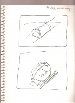
I must be getting more tired as the week goes on because these don't look anything like they should. The first one is my eyeglass case. Boring! The second is my flash light radio that keep by my bed for when we have storms in the middle of the night and the electricity goes out-I hate that! That's the bigger shape, the smaller cylinder was Mom's flashlight that she kept by her chair in the living room for the same reason. Now its mine.
The Stove and My Hand Friday, Nov. 6, 2009
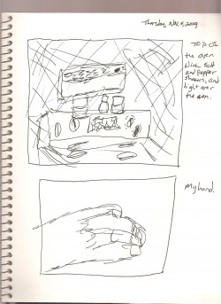
Top picture is the stove top and the salt and pepper shakers on the back of it. The rectangle above the stove is the light we use when we need to see what we are doing on the stove. The bottom picture is my left hand. People have always told me that if you want to learn to draw hands, draw your own. That was pretty stupid to me because I could only draw my left hand since I'm right handed. So I only know how to draw my left hand. If you want to learn to draw hands, you need to draw other people's hands.
The Potato Brush and Microwave Friday, Nov. 6, 2009
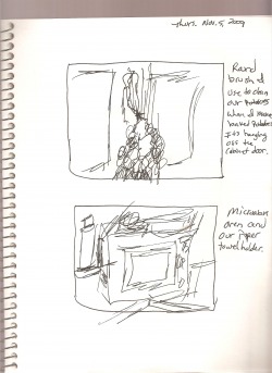
The potato brush is this round brush that Mom always used to clean the potatoes before she cooked them. Now I use it when I make baked potatoes for me and Dad. This thing has been around the kitchen for as long as I can remember. I keep where Mom always kept it, hanging on the cabinet door over the stove. The second one is the microwave oven and the paper towel holder sitting next to it. I tired to show some of the stuff that is piled on the microwave, and its the only thing that looks like cooked spaghetti. So I think I did that part right.
Last Night's Gesture Drawings Friday, Nov. 6, 2009
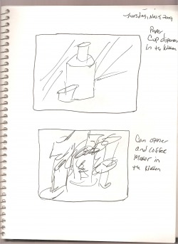
I didn't post anything last night because I was too tired and it was too late to post, but I did get some gesture drawings done. I sat in the kitchen last night and found some things to draw. The first drawing is the paper cup dispenser we have in the kitchen which has SpongeBob Square Pants cups in it ( this is mainly for my little nieces and nephews who come over and want some water or kool-Aide) I think that was a paper cup in front of the dispenser. The second drawing really looks like cooked spaghetti. That was the can opener and the coffee maker on the counter. You can't even tell what that is!
Gesture Drawings Cont. Wednesday, Nov. 4, 2009
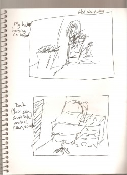
The top drawing is my pink baseball hat that I have hanging on my bedpost in my room. It was a gift from dad last summer. The bottom drawing is my desk chair with my pillows stacked on it in my room. They don't really look like cooked spaghetti yet. I wish I could have done more drawings today, but I had to work, and that always seems to come before the things I want to do each day. I hate that. Tomorrow I will get more gesture drawings drawn in my sketchbook and posted here on my web page.
Gesture Drawings Cont. Wednesday, Nov. 4, 2009
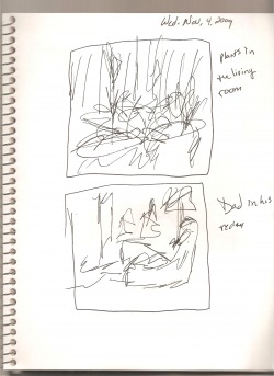
These are the plants we have in front of the picture window in the living room. The bottom drawing is dad sitting in his recliner watching television this evening.
More Gesture Drawings Wednesday, Nov. 4, 2009
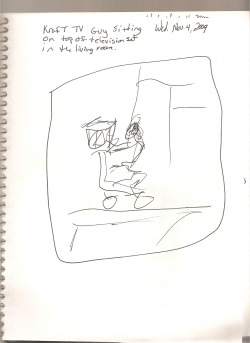
This is something that has been in my house since I was a kid. It's a little black and yellow camera guy with a K on the camera. Dad said that it is the Kraft Camera Guy. Way back when, this little guy was on T.V. during commercial breaks because Kraft sponsored a lot of T.V. shows in the fifties and sixties.
The Squiggles Within II Tuesday, Nov. 3, 2009
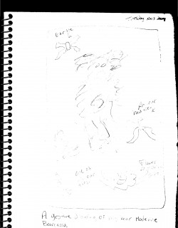
This is my build-a-bear that I created this summer, Madeline Bearcasso. I made her with the idea in my mind that I want to write stories about her, and then illustrate them. I haven't done that yet, but I am still thinking about what kind of stories I will write and illustrate about her. She is an artist bear that I created. I think that when I do these drawings again, I will do them in pen so that they will show up better on the page. I also did some gesture drawings of her ear ties and the clothes I have her in.
I am going to spend the next one to two weeks working on doing these gesture drawings so that I can get better at them. The cool thing with this is that you can do them with anything, a landscape, object, person, or something from your imagination. My homefun assignment is do try this with a story I am interested in, and to continue looking for the movement in things. I am going to work on actually doing the drawing work. This should be fun!
I am going to spend the next one to two weeks working on doing these gesture drawings so that I can get better at them. The cool thing with this is that you can do them with anything, a landscape, object, person, or something from your imagination. My homefun assignment is do try this with a story I am interested in, and to continue looking for the movement in things. I am going to work on actually doing the drawing work. This should be fun!
The Squiggles Within I Tuesday, Nov. 3, 2009
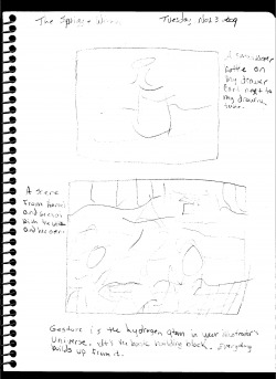
This is my first lesson from "Make Your Splashes, Make Your Mark" illustration course. The whole idea was to work with gesture drawing. You don't spend a whole bunch of time on these drawings becasue you are just getting the basic feel of the object, scene, or model on to paper. I have done gesture drawing before, but when we did it in college in was the traditional kind of gesture drawing; you draw the object in a few seconds without worrying about the details and if it looks right, just get the feeling of it down. I never spent much time on this kind of drawing because I was taught that it was more of a warm up exercise than anything else. But it is a way to observe and get your ideas down on paper first before you do any serious drawing.
Holding (Color) Court III. Sunday, Nov. 1, 2009
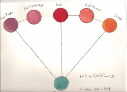
Not only can you make a wide range of tones by adding the queen color, blue-green- to you other two colors on either side of your dominant color, but you can leave the blue-green out completely and just mix your dominant color with one of it's BFFs. These two colors will always be bright and not darkened when they are mixed together.
And I have tell ya, when I was in Design Color class in college, we never learned this. We did the really basic stuff like the primary colors, and the secondary colors and how to get them, and the tertiary colors and how to get those, but we never learned that you could actually paint a picture using only two to four colors on your color wheel. And when I took Watercolor Painting in college, I had to paint a traditional color wheel on large watercolor paper. It looks really great, but then what do you do with it? That kind of education means that you have a very basic understanding of colors, but you don't really know what to do with them, or how to use them in final piece of work. And that is not as helpful as this information is.
And I have tell ya, when I was in Design Color class in college, we never learned this. We did the really basic stuff like the primary colors, and the secondary colors and how to get them, and the tertiary colors and how to get those, but we never learned that you could actually paint a picture using only two to four colors on your color wheel. And when I took Watercolor Painting in college, I had to paint a traditional color wheel on large watercolor paper. It looks really great, but then what do you do with it? That kind of education means that you have a very basic understanding of colors, but you don't really know what to do with them, or how to use them in final piece of work. And that is not as helpful as this information is.
Holding (Color) Court II. Sunday, Nov. 1, 2009
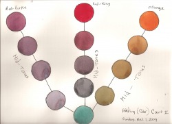
The important thing to remember about this color selection is that when you add blue-green to any of these colors, you will get wide range of mid-tones. Red is king, and blue-green is the queen. When you pick your dominant color for you picture, you will be using the color opposite that color on the color wheel to get your other tones. Then you use those tones in the painting you are going to paint. And these tones can be very extensive depending on how much mixing you want to do.
Holding (Color) Court I. Sunday, Nov. 1, 2009
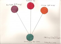
My last lesson taught me that I can create a whole picture using just two colors and all the ranges of color in between them when they are mixed. Now we are adding two more colors. When you do a painting, you want to pick a dominant color such as red. This color has two BFFs, and they are orange, and red purple. This means that red and orange will look good together, and red an red purple will look good together. The color opposite the red on the color wheel is the blue-green.
Singular Color Contrast Thursday, Oct. 29, 2009
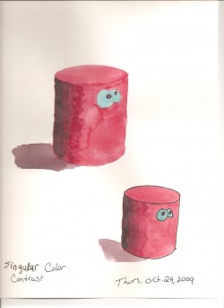
I am not sure if I have done this exercise right or not. I sort of did the same thing with red and blue green as I did with the orange and the blue on the color wheel. I made red my dominate color and then added blue green to the red as I made my darker shades. I tried to get as close to a shadow color as I could for the cast shadow. I also chose to do one of these without and outline and one with an outline to see which one looks better. I usually do my drawings with a black line then color them in with watercolors or colored pencils, but I'm not sure if that would be considered the same as adding another color (black) to the picture. It's just that sometimes I feel like I have more control over the drawing when I do it in a black outline then color it in. But this also looks a little too stiff, and rigid. The bigger drawing looks more relaxed. I'm not sure which one I like better.
Halloweenie Beanie In Two Colors Tuesday, Oct. 27, 2009
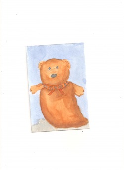
This was my painting I did in two colors. I was trying to make most of the painting in orange, but I'm not sure if I succeeded at that. The colors look more even to me than that. To do the eyes and nose, I mixed the Cadaminium Orange and Cobalt Blue together until I got a blackish color. For the shading, I mixed the Cadiminium Orange and Cobalt Blue in different amounts to get the shading I thought was right. Another thing I wasn't sure about was whether or not I should have used a black pen for an outline like I do in some of my sketchbook entries. For me, that defines the subject more. I didn't have a story, and I didn't have a photograph that I liked to do this assignment, so I drew from the actual subject. I realized that to do a painting in two colors and take into consideration the shading of the object, you have to mix your two colors in various amounts. I'm not sure if I like this painting, and I'm also not sure if I did it right. But I tried.
I haven't posted anything on here in awhile because I have been a little busy here at home. At least I finally got something on here again.
I haven't posted anything on here in awhile because I have been a little busy here at home. At least I finally got something on here again.
One Brush Stroke Against Another Tuesday Oct. 27, 2009
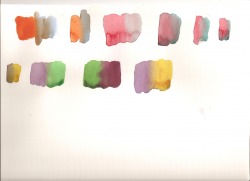
Actually, this was Lesson 11 of my color course from Mark Mitchell. I put one brush stroke against the other to see what would happen. I tried to do this with each of the colors and their compliments, and I did a couple of them more than once because I thought I had used too much paint and I simply ended up making a puddle that didn't seem to do much color-wise. I'm not sure if I did these correctly or not. But, I tried.
Mixing Complimentary Colors Monday, Oct. 20, 2009
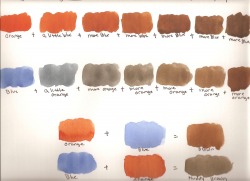
I am still working on the power color course I am getting in my e-mail. I decided to not just read about mixing complimentary colors, but to try it myself and see what I get. I used Cadaminium Orange and Cobalt Blue because those are the only two colors on my color wheel that you don't have to mix. You can use them straight from the tube with a little water. I learned that depending on which color you are adding to, you can different shades of brown and muddy brown. In the first line of colors, I added the blue to the orange and I got different shades of brown. But when I added orange to the blue, I went from a slate blue to a muddier brown color. I got to thinking that maybe if you had just about the same amount of each color and mixed them together you would probably get two different outcomes. I was right. I started with orange again, and then I tried to add about the same amount of blue and I got a brown color. When I started with blue and added about the same amount of blue I got a muddier brown color. You will get two different outcomes when you mix the same two colors together because of what color you dominated/or started with.
My next homefun assignment is to paint a picture using just two colors from my color wheel, and using the different shades of each mixture I come up with. Something tells me it is easier said than done. I have to decide what it is I am going to paint, and then go for it. Wait until tomorrow.
My next homefun assignment is to paint a picture using just two colors from my color wheel, and using the different shades of each mixture I come up with. Something tells me it is easier said than done. I have to decide what it is I am going to paint, and then go for it. Wait until tomorrow.
Completing Colors Sunday, Oct. 18, 2009
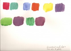
I read through lessons 5 through 9, there wasn't a lot to do in the way of painting, but I went back and re-read lesson 5 and I decided to see if the colors oppisite each other on the color wheel actually did brighten up when they are placed next to each other as Goethe had discovered. I ran into a couple of problems here. My colors were washier than what I came up with on the color wheel because the colors I squeezed out on my palette have hardened, so I wasn't using globs of color to mix my colors. They were really more like washes. Also, I used the remaining colors that I had already mixed on some of the colors, so when you add water to revive them, they got washier as well. When I was doing my color wheel, I noticed that I was having trouble getting my purples right. On my completing colors, my purple and red purple look too much alike. Since I used a cheap piece of water color paper for this experiment, I think that may have had an effect on the paint as well. I may try this again in a day or two.
A Color Wheel I Can Be Proud Of Saturday, Oct. 17, 2009
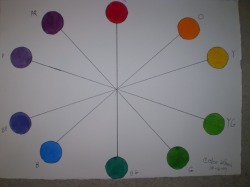
This was my next lesson in the Power Color course. I had to do a homefun assignment (homefun not homework because if you are doing art and it seems like you are working at it, then you probably shouldn't be doing art.) which was to do a color wheel I could be proud of. (Basically, do the color wheel again.) I used a ruler this time to get my lines straight, and I drew around the bottom of a small bottle to get my circles looking the same size. The only color that really seemed to give some trouble was the blue purple color. If I added to much Alzirian Crimson to the Ultramarine Blue, then would be more of a purple red color. If I added too much Ultramarine Blue then it was more of a purple color. I really had to mess with that one for a while, but I think I got it right. This color wheel didn't take as long as the first one I did. I think it might be because I had better idea of what I was trying to accomplish. I like this color wheel a lot better than the first one.
I did this wheel last night. I was dead tired, but I really wanted to get on to the next lesson, so I stayed up a little later than usual to do it. I was planning on getting pleanty of sleep last night, but my dog, Calvin, kept waking me up to go outside. At least I thought that was what he wanted until I tried to put him out at 3:30 this morning. I opened the back door and he just stood there and sniffed the air then turned around and went back into the kitchen. I closed the back door and went back to bed. At 4:30 this morning, Calvin was right there scratching on the side of my bed wanting to go out. I stumbled into the kitchen with my dog right behind me, and this time he went out. Good. I thought. Now I can go back to bed and get some sleep. Next thing I know it's 6:00 in the morning and Calvin is not only scratching on the side of my bed to get my attention, but he is also barking at me. I looked over the side of the bed and all I see are these two little black eyes staring at me and a little black nose sniffing the air. This time, he wouldn't follow me to the back door. By this time, that dog was getting on my last nerve. He was terribly active, so I got dressed and we went for a quick walk around the block. It was still dark outside; cool and quiet. After the walk and a shower, it was off to the grocery store this morning. When I got back, I was so tired all I wanted to do was lay down and sleep. I slept for a few hours then got up again. Because of all of that, I didn't have the energy to go on to the next color lesson. I wanted to do something, so my sketchbook entry was it for today.
I can't wait for summer vacation!
My Color Wheel Thursday, Oct. 15, 2009
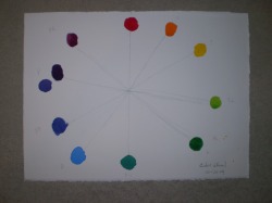
I came across a web site that I am very interested in. It's called howtobeachildrensbookillustrator.wordpress.com. I happened on it while I was reading the posts on the EDM (Everyday Matters) web site. This is a really cool site! This man who has illustrated children't books and magazines runs this really cool web site/blog on illustration children's books. He also offers a course on illustrating children's books for about $216.00 which isn't really bad at all. I was thinking of signing up for the course, but I wasn't sure if I would be able to do the work. Mark Mitchell offers a Power Color course free of charge so if anyone is interested in the course, they can try out that part of it for free. That is what I am doing now. The first thing he has a doing is making a color wheel. This si not a typical color wheel like what we learned in school. Mark uses a different set of watercolor paints for his wheel. I spent some time this evening working on this. I think I did it right, but I'm not sure. I screwed up the blue purple spot on my wheel, but I tried to re-do it next to the spot I screwed up. If his whole course is this much fun and interesting, then I am going to think more seriously about taking this course.
I love children's books! I have wanted to write and illustrate one myself, but I don't know how to begin, or what to actually do. Mark goes into the business of children's book illustration and you learn how to present your work to publishers. I would love to get into this area of art!
I love children's books! I have wanted to write and illustrate one myself, but I don't know how to begin, or what to actually do. Mark goes into the business of children's book illustration and you learn how to present your work to publishers. I would love to get into this area of art!
Seussical Bending Buildings Thursday, Oct. 15, 2009
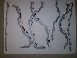
This is a picture I did a few weeks ago. I didn't feel well for quite a while and I didn't get much done artistically. This is a bigger version of the Seussical bending buildings I like to draw.
Staggered Buildings Thursday, Oct. 15, 2009
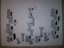
I actually did this drawing a while back with the intention of posting it here on my web page, but because I was sick for a while and trying to work, I didn't get the chance to post this until now.
Clown Collage Monday, Sept. 21, 2009
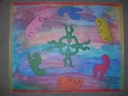
This was my collage that I was working on. I found the little clown shapes at the dollar store last week when I was out hunting for collage items. They were part of the back to school stuff they had. Of course, these are just made out of green paper not card stock. If you want good card stock items like that, you would have to go to The Supply Closet-a teacher's store. I kinda like this one better than the Artist's Muse Game project because I like the colors. I like pinks, blues, and purples.
I shuffled the clowns around until I came up with this arrangement, then I traced around two of my french curves and cut them out, and arranged them the way you see them here. The only problem was the white background of the board I was using. Too much white! Since it was clown oriented, I wanted to make the background colorful and kinda fun, so I just splashed watercolors all over the board to give it a background, then I glued my shapes in place. It was still needing something. I dug through my collage box and found the ribbon, so I used that as a border around the whole picture. Now, whether or not I mangaed to pull this into a whole picture with a center of interest, I'm not sure. I'm going to wait until tomorrow after work and then take a second look at it and decide that.
I shuffled the clowns around until I came up with this arrangement, then I traced around two of my french curves and cut them out, and arranged them the way you see them here. The only problem was the white background of the board I was using. Too much white! Since it was clown oriented, I wanted to make the background colorful and kinda fun, so I just splashed watercolors all over the board to give it a background, then I glued my shapes in place. It was still needing something. I dug through my collage box and found the ribbon, so I used that as a border around the whole picture. Now, whether or not I mangaed to pull this into a whole picture with a center of interest, I'm not sure. I'm going to wait until tomorrow after work and then take a second look at it and decide that.
The Artist's Muse Game Monday, Sept. 21 , 2009
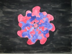
This is my project that I finally did for the Artist's Muse Game. I picked the puzzle piece as my design subject, then I picked red as my primary color, purple as my secondary color, and black for the muted color. I'm not very satisfied with this project. When you play this game, you are suppose to do the projects in watercolor, but this was a large project, and I think the watercolors are too washy. The larger the area was, the harder it was to get a solid color. The smaller the area was, the easier it was to get a solid color. I think this would have come out better if I had done it in colored pencils.
Friday, August 28, 2009
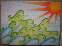
This is the first webpage I have ever had. I want to use this as a place where I can share my artwork and do a some writing. I want to start a blog about what I am doing as an artist and what I want to do in the future as an artist. I have posted a picture that I finished last week. I basically just doodled it out and I call it The Emerald Sea Creatures.
